
Research Notes present provisional, object-centered studies exploring handwriting, print, and other written forms. These essays reflect ongoing research and are intended to document questions, observations, and emerging interpretations rather than to offer final or comprehensive accounts.
The notes collected here often arise from close examination of individual artifacts or small groups of materials and may cross disciplinary boundaries, including penmanship history, typography, print culture, and material studies. Some notes may later develop into formal articles or book chapters, while others remain as contextual records of inquiry.
This section is maintained to support transparency in research, encourage dialogue, and preserve lines of investigation that contribute to a broader understanding of handwritten and printed texts over time.
Backslant Type and the Intersection of Handwriting and Print History
Slant, or the absence of slant, is a deliberate choice in all typography and all writing. While a vertical orientation is frequently treated as neutral for printed matter in particular, typography and writing may also exhibit backward slants of varying degrees, as well as rightward slants, which are more common and likewise appear at many angles. For carving, engraving, and typography, slant may be governed by practical considerations of legibility and efficiency, or it may be selected primarily for visual, stylistic, or expressive effect.
Typographic discussion is relatively muted regarding slant as compared to the debates among penmen and those who are adherents to styles. The authors and teachers who promoted penmanship styles defined preferred slants that they presented as optimal according to their own criteria and historical context—a choice that is understandable, as slant is inseparable from the identity of a style. Slant has been discussed extensively in penmanship manuals of all kinds—often at great length, and in some cases with more emphasis on verbal explanation than on illustrative examples. In penmanship, slant, as just one element, is a subject of intense debate and it is so heavily emphasized that any “incorrect” angle could render all the writing unworthy, regardless of its legibility and utility.
This thumbnail sketch, while incomplete, is a short overview so that one can better appreciate and understand items I have personally collected and to see them in a broader context. My interests extend beyond handwriting into the study and collection of typographical material as it offers a discussion with written matter. Accordingly, selected examples of printed matter are included in the Kaminski Handwriting Collection to examine the geographic and chronological boundaries of slant, where such boundaries can be identified, and to assess its functional and visual purposes within broader systems of written communication.
One early printed example in the collection illustrating these questions is a Davis & Brown (Samuel Davis and Robert Johnston Brown) billhead from Boston, dated March 27, 1815. (See a larger 1814 example from Historic New England at this link.)
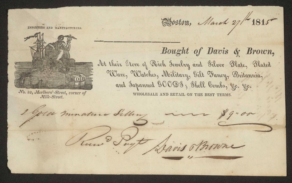
Davis & Brown, receipt, March 17, 1815, archival image, Kaminski Handwriting Collection. Item can be found at AAS.
While collected by others for its fine graphic in the upper-left corner, its leftward slanting type is one of the earlier examples I have seen. Notice that it is also one of seven typefaces on this receipt. Are so many faces intentional or simply a result of efficiency and available type? One must believe that the backslant itself is chosen to highlight the sellers, the items “Rich Jewelry and Silver Plate…[and] Watches,” among other items sold by Davis & Brown. The multitude of typefaces and point variation, both more common and less common, may present an obstacle for the average printing shop, including a forger. Reverse angle type is not uncommon in bank checks, for example, in the decades that follow, thus indicating it could be an enduring obstacle for forgers, or, at least, comfort to the majority of clients.
Is there some other possibility? Could the printer simply have run out of other type? Did he have other “standing type” that is here repurposed? Four typefaces stand out as repurposed: “Boston,” the partial date “181″ certainly, while “IMPORTERS AND MANUFACTURERS.” and “WHOLESALE AND RETAIL ON THE BEST TERMS.” would be common phrases for billheads in a manufacturing and port city such as Boston. The three remaining typefaces would require individualized typesetting. “Bought of” might be standing type, but the remaining component “Davis & Brown” requires an addition. The business address and the description of the shop’s items are in two new and different typefaces, a common italic slant, and a backslant. Is the highly decorative backslant only for the purposes of catching the eye for the discerning and rich customer? It serves as a receipt, so it comes after the purchase, and comes only afterwards. Is it a visual guarantee that the money spent on the item, however extravagant, is worth the expense? It could be reassuring. Is it reasonable to believe that security may also be a purpose of the reversed-angle typeface in this business receipt for jewelers and fine goods in the early nineteenth century? Perhaps.
To address this plainly and more directly as grounded in academic literature rather in this single piece, scholars of early American print and material culture have noted that typographic variety and ornament in commercial printing often functioned as visual signals of legitimacy, prosperity, and refinement—particularly in luxury trades—rather than serving exclusively functional or anti-forgery purposes.
Lastly, one must address several additional elements on the billhead. The line printed for the purchaser’s name is not straight, suggesting that no rule was used and that individual sorts were employed instead—a notable departure from the precision otherwise evident in the work of a trained printer. While the overall richness of the typography may argue for refinement, this particular line does not. The printer has, in effect, abandoned the exactitude of his craft here in anticipation of the line being overwritten and serving only as a placeholder for a handwritten name. It is printed, but surprisingly, not designed to be seen. For an “exact” comparison, one can look to the 1814 Davis & Brown billhead from Historic New England and see that the name is included there. In this surviving example, however, the line remains conspicuously blank, despite the document’s function as a receipt. In contrast to the typographic backslant, the handwriting itself is engaging—more so in some places than others—with a deep descending stroke on the “7” and particularly expressive abbreviations for “th” and “Received Payment.”
Interestingly, six years later in Philadelphia, this same backslant typeface appears in Charles William Bazeley’s 1821 edition of Elements of penmanship: simplified and illustrated.* Here, it appears for entirely different reasons. In this book, Bazeley’s second edition, the angle is proposed for a singular social purpose.
Bazeley describes the value of the typeface as a model for the women’s finest handwritten etiquette. He uses the term “reversed hand” and says of it the following, on page 35 of his book: “The reversed hand contributes to an agreeable variety, in cards of compliment, invitations, and exhibitions of fanciful and ornamental penmanship. It may be written by changing the position of the arm, or by reversing the position of the paper, from what is customary when writing the text hand.” By suggesting that this typeface be used as a writing script, Bazeley is in effect promoting it both as a new writing style and also as the first reversed angle writing style of which I am aware an author endorses in the United States. (Please advise me when you find an earlier author. It is a curse to chase this detail.) It may be worth noting that this typeface, while among the earliest reversed-angle script faces used in the United States, is not designed to accommodate the fluid motion of the pen between all letters as actual penmanship scripts do. At best, it is calligraphic or decorative.
*(Bazeley’s 1811 first edition is a book of an entirely different kind, and it bears no resemblance to the second edition.)
